Preview
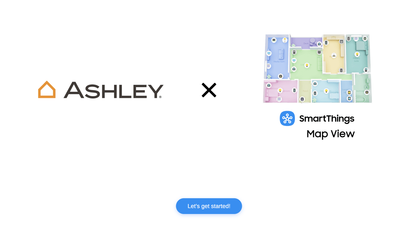
Optimized hero screen for retail
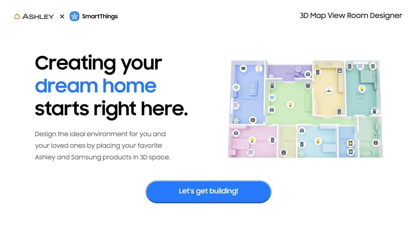
Landing page shows interface purpose with a clear CTA, header, and primary interaction.
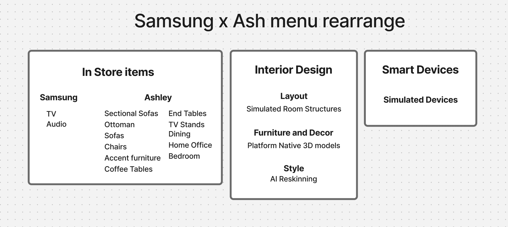
Clarified menu hierarchy
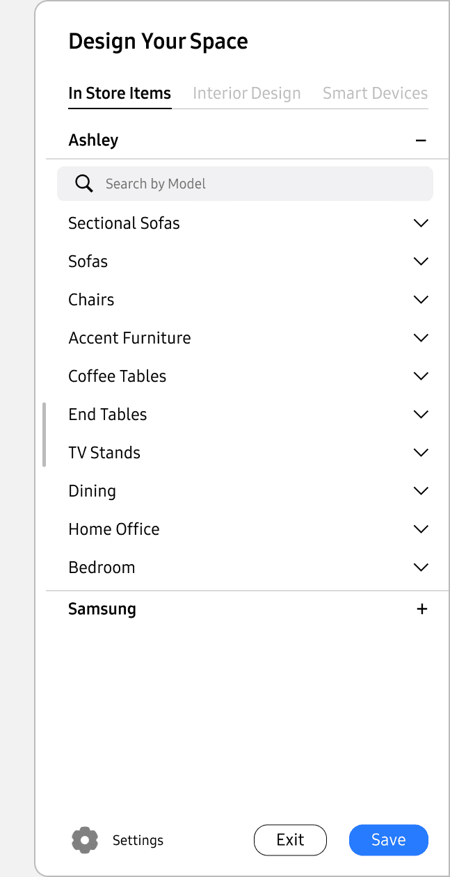
Intent driven menu division ensures presents product offerings and building options clearly.
Optimized to build and explore
Background
Ashley Furniture was interested in developing a virtual sectional builder focused on driving lower funnel conversion through clear visualization and personalization.
Samsung Global sought to monetize the existing 3D tech in SmartThings 3D Map View, and Samsung US wanted a SmartThings registration touch-point in store.
I saw strong functionality stuck with a UI that would never land with customers or staff in its current state. It was unbranded, difficult to navigate, and not optimized for the retail floor.
Design efforts
Target user experience
The experience is designed to allow rapid replication of an in home environment. allow scaled 3D furniture model placement, confirm optimal configurations, and introduce how smart home tech can benefit shoppers.
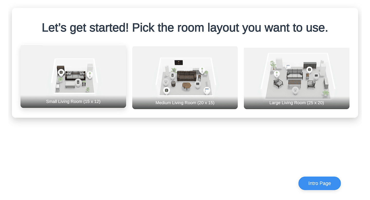
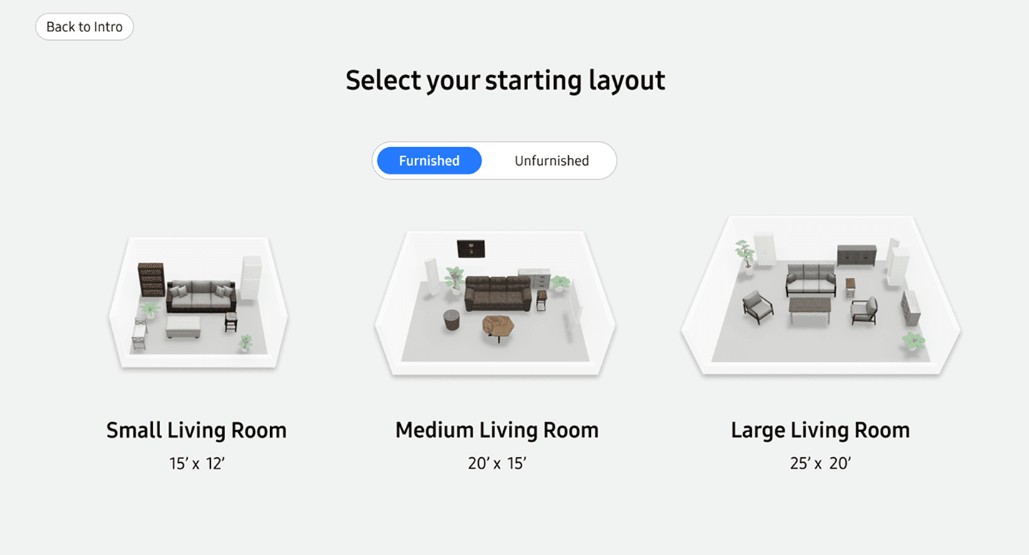
Landing page + room selection
I focused on increasing the visibility of interaction points, presenting the ability to select furnished or unfurnished starting maps, and leveraging existing visual assets where ever possible.
Before
After
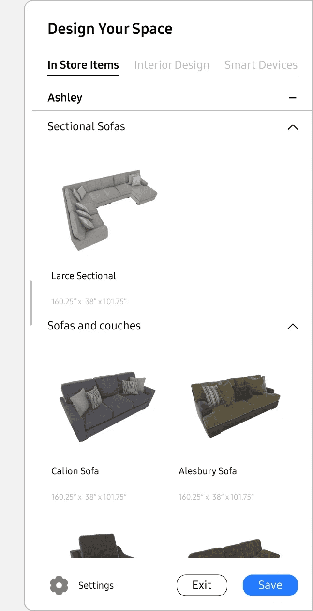
Side menu revision
Initial menu structure presented all potential information in a single location with limited organization.
Before
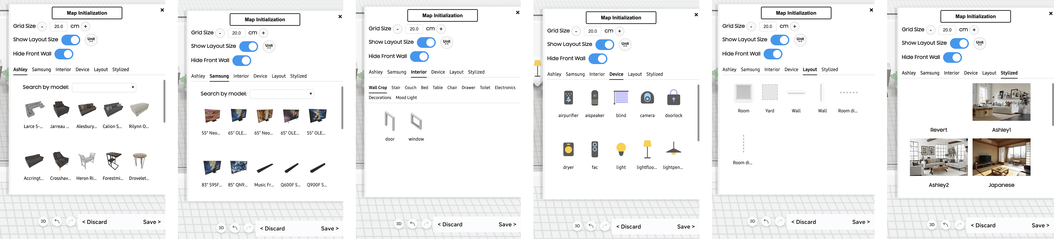
I broke out categories and adjusted the menu nesting structure. Work was also done to ensure product cards had an organized layout and the ability to present all relevant information.
After

Final menu formats feature a redesigned search bar, hierarchy, and updated button legibility.
Engineering prioritized the presence of a settings menu, which I reworked to present customer relevant information.
Error prevention within the bounds of current structure
For critical interactions where I predicted user error I worked to included preventative messaging and the opportunity to redirect.
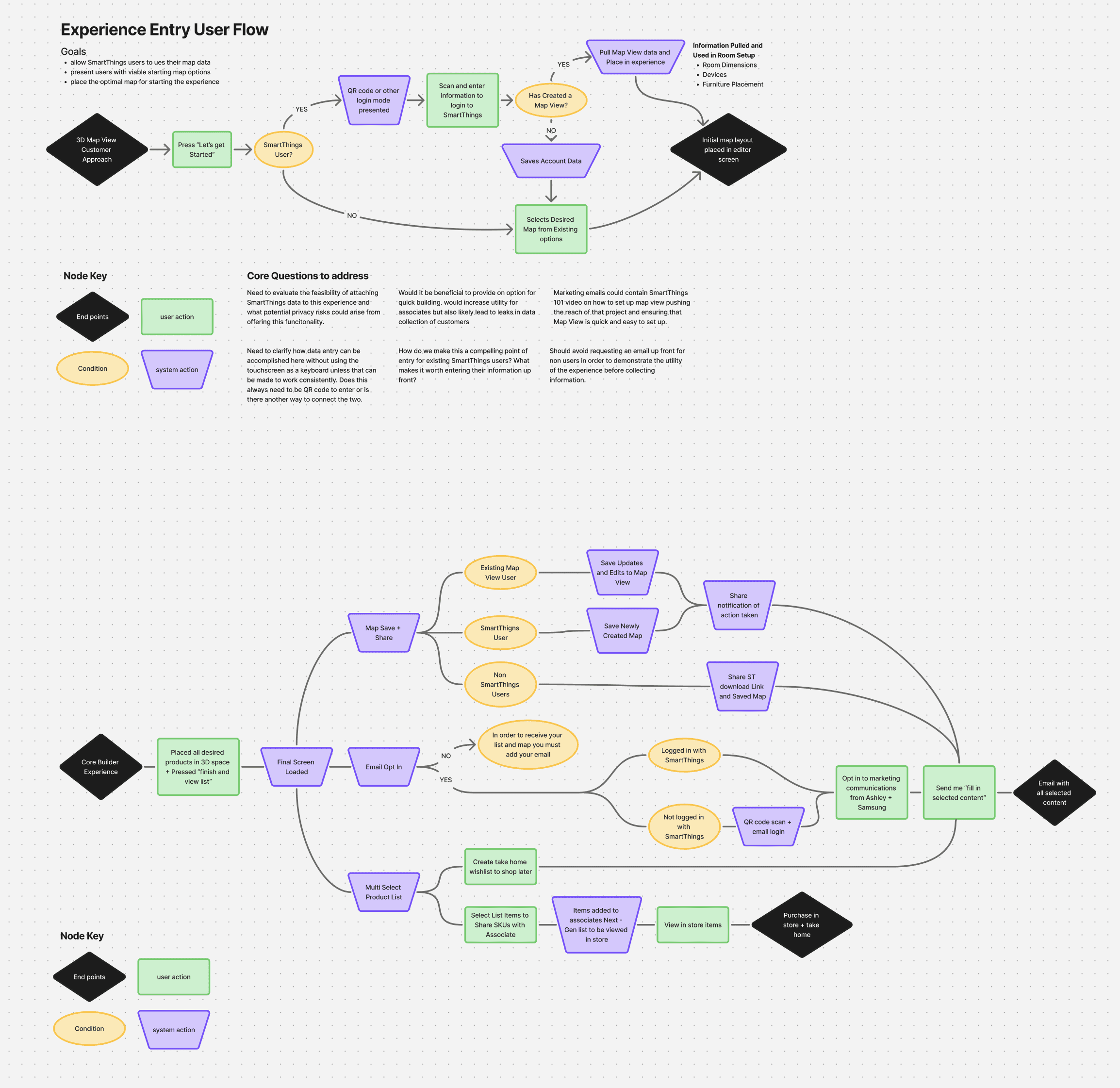
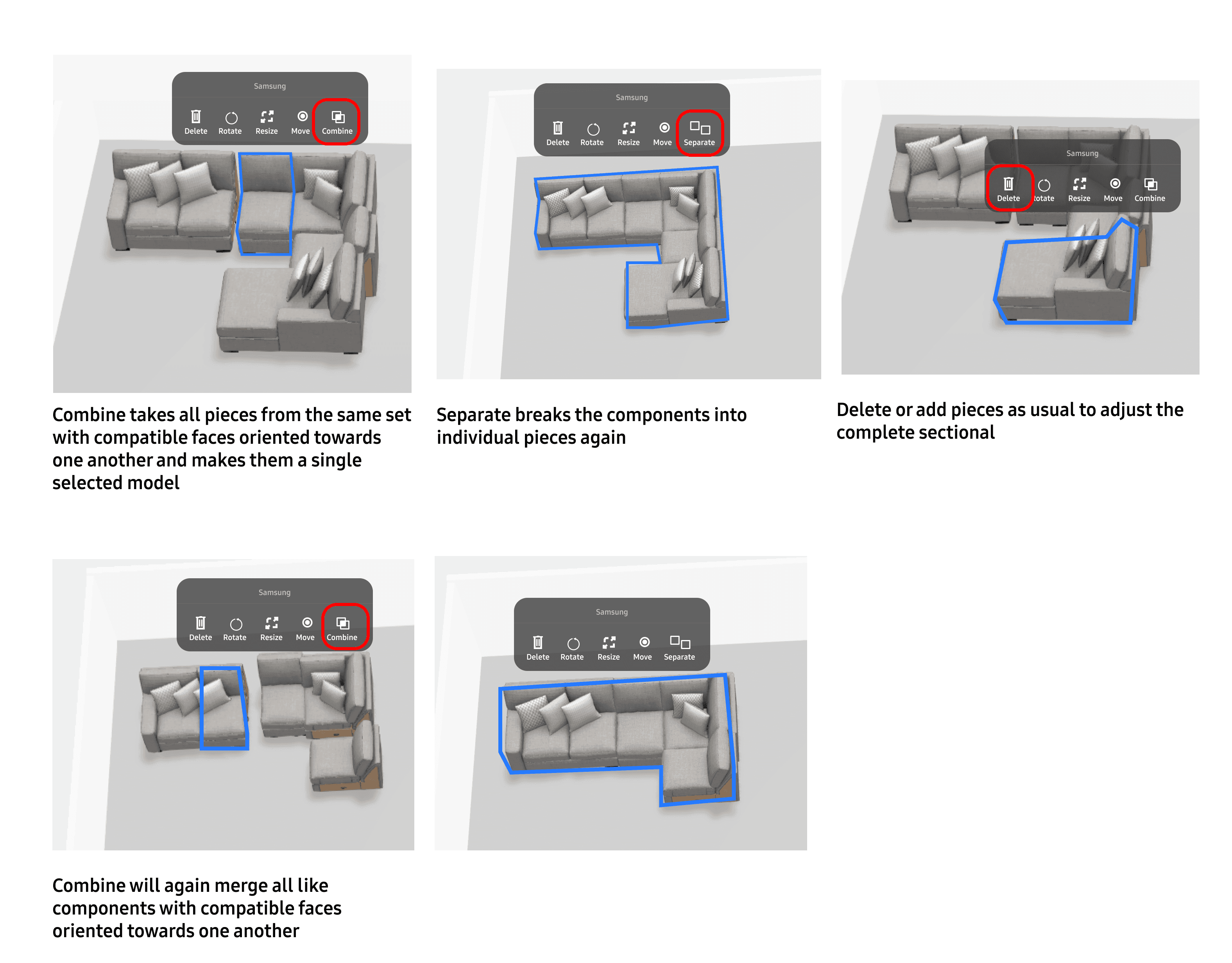
Sectional snap to build functionality
The project scope came to include modular sectional model construction in addition to the placement of complete models. I worked with Ashley staff to scope their goals for the feature and with Samsung engineering to communicate technical limitations.
Following some discussion between teams I proposed two potential building concepts shown below.
Concept 1
Concept 2
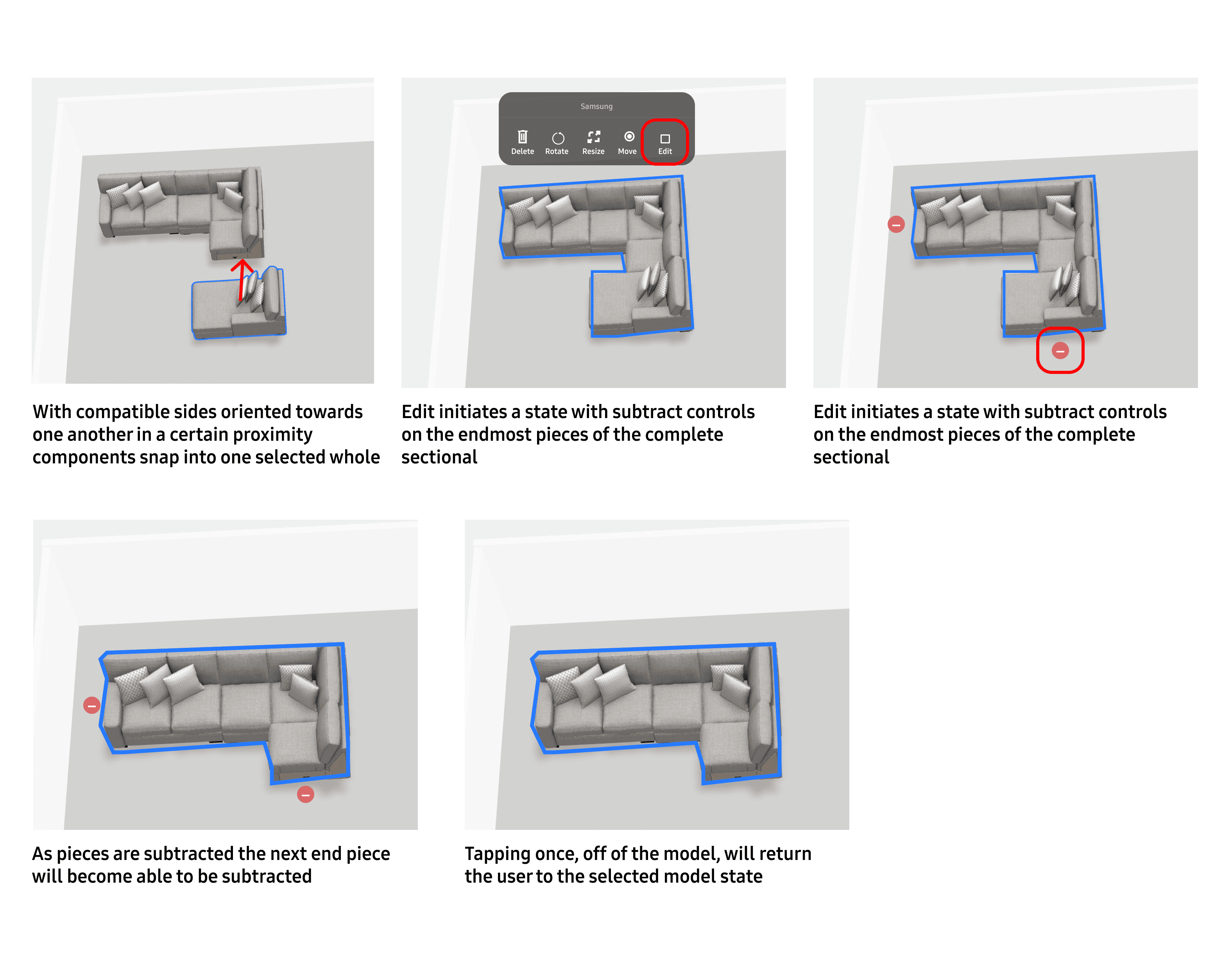
The engineering team pushed back on leveraging defined "sticky" surfaces because of the required meta data. We settled on a combined approach using the menu controls from concept 1 with the active end points and "magnetic" interaction of concept 2.
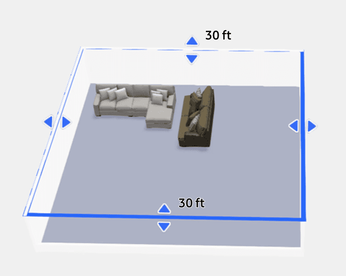
Room scaling & smart device menu
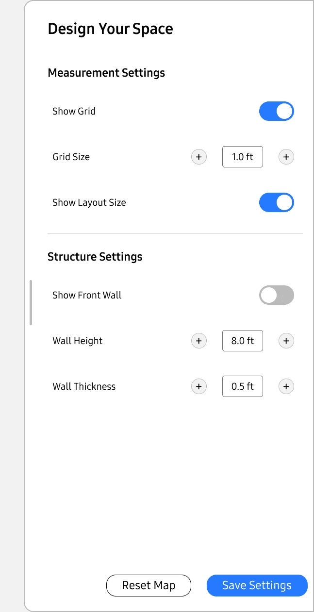
Because furniture models and rooms were rendered to scale I pushed for these measurements to be present during room layout adjustment.
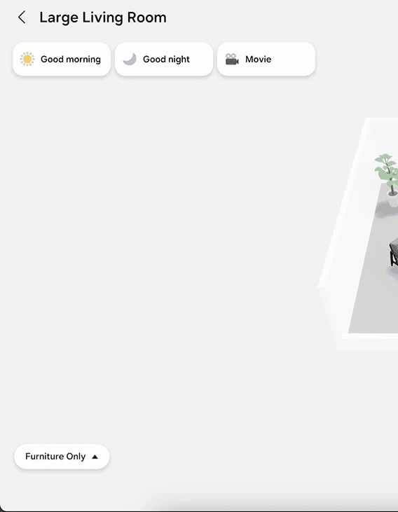
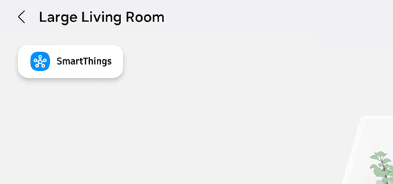
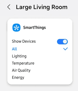
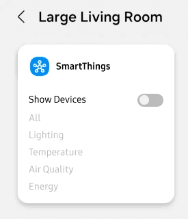
To reduce on screen clutter and group related interactions I restructured the SmartThings device menu. It shifted from having no branded label to being one nested menu for all smart home functionality.
Constraints
Dev resource limitations
This was one of many projects handled by our engineers at that point in time. I worked to ensure proposed changes were within scope and worth resource allocation.
Solo designer and international project liason
Served as solo designer on this project handling asset transfer between organizations, project scoping, and as the main point of contact between teams in Korea and the US.
System restrictions forced adapted communication
All communications about design updates and proposed feature expansion was carried out through redlined PDFs and email.
Outcome
Leadership demonstration and expansion planning
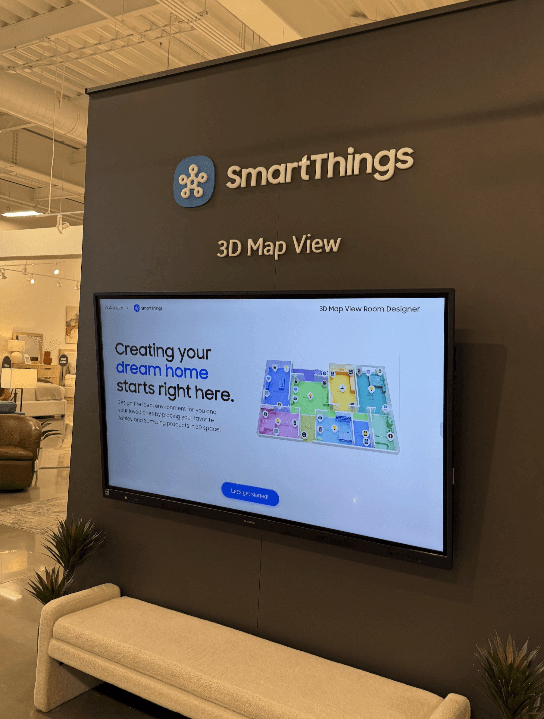
During CES 2026 Samsung & Ashley executives met at Ashley's flagship Las Vegas location to discuss the future of our continued retail partnership.
I demonstrated this experience on a 75" touch display for the executive group, generating a conversation on implementing the software on sales associate tablets as an in-store enablement tool in the 36+ locations listed for partnership expansion in 2026.